How to choose the right color for your email signature
An appealing email signature design means much for proper disclosure of your personality and brand. It is more than just a name and title. This small detail usually makes the first impression and sets the tone of the email communication.
Critical functions of any email signature are to provide information, attract attention and encourage response. Thus, it has to be both attractive and informative. Luckily, with broad email signature software functionality, there is no problem with fitting all the required information into a signature’s small space.
When it comes to attractiveness, a carefully selected color scheme can solve the matter, as it both attracts the eye and conveys meaning. Let`s go deeper into details about choosing the most suitable colors, mixing them, and creating a harmonious and meaningful picture.

Color psychology in email marketing
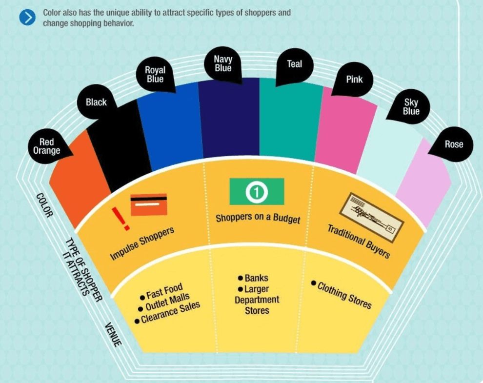
In an email marketing campaign, every single detail affects the overall success. Therefore, the usage of subconscious messages plays an important role. While presenting a piece of written information, color appears to be the most effective medium of the hidden meaning.
Due to the specific perception of colors by the human mind, there is a wide range of opportunities to use color for the benefit. For email marketing, color psychology is a decisive factor in the campaign’s success as people have developed solid subconscious associations between colors and emotions in the course of evolution.
The application of color psychology in email marketing helps to use these associations to benefit the message’s primary goal. Thus, the Seoul International Color Expo research found that 93 percent of buyers focus on visual appearance, while almost 85 percent claim color is a primary reason for making a purchase.

Email signature color tips
Considering your personal color preferences, design trends, and the meaning you want to convey by your email signature, making a final decision may be challenging. The variety of shades and tints may confuse.
If you still wonder how people make their email signatures look so good, you need to learn several secrets. Here are universal tips that will help you make the best possible colors for a perfect email signature.
Keep the colors simple and consistent
When choosing a color palette for your email’s signature, follow the rule ‘less is more.’ Using too many different colors overloads the picture and confuses it. You need to accentuate the text, not overpower it.
Besides, the risk of choosing clashing colors grows when you try to combine multiple colors. Thus, stick to more neutral, calm, and modest color tints whenever it is possible.
Make colors fit with your visuals
Alignment and balance between the email signature colors and visual elements are essential characteristics of a successful email campaign. Follow the principles of visual hierarchy and try to maintain balance.
Keep your font palette even more straightforward than color. Choose a font signature that won't distract the attention and look too complex or heavy. Some of the font elements may get undistinguishable and difficult to read when the color is too light, and the background is not contrasting enough.
Use your brand colors
The easiest way to choose the right colors and ensure harmony is to stick to your brand color scheme. Besides, if you do not want to adapt your email signature for every new email campaign, brand color is an excellent option.
Furthermore, brand colors make the email campaign recognizable, as people tend to develop color associations. Therefore, your email signature will get strongly associated with your brand and, what is more important, with its value.
Add your personal touch using colors.
An email signature is one more vital opportunity to express their creativity and talent for those working in the creative industry. A stylish email signature requires following trends yet preserving personal touch.
In 2021, minimalism and clean design are in trend concerning fonts. Thus, the color remains the element that still leaves some space for creative expression. Experiments with bright and juicy colors may prove highly successful if the overall harmony is not spoilt.
In this case, choose colors with your heart, yet combine them with your mind.
Don't overload your signature with too many colors
Too many colors in one piece look too busy and messy, especially when these colors are bright. We bet you do not want to make an impression of a person with no taste and sense of beauty.
To stay neutral and highlight only the significant parts of your email signature, limit yourself to 2-3 colors. Even a limited selection of colors may look different depending on the background.

Best color combinations for signatures
Emails signature is a small but crucial element of your branding, as it provides vital information and visually showcases your brand identity. While official email signatures are usually modest and neutral, there still some options to adapt bright hues for proper color accents.
This is what 2021 color trends dictate us to do, as the upcoming color trends are soft yet juicy and natural at the same time. Since 2020 proved to be rather challenging and stressful, despite a widely spread expectation of bright and futuristic tendencies, 2021 is to bring tranquility and soothing.
Let’s mention those, which may appear to be game-changing and worth following for your emails signature design:
- juicy, super-saturated colors;
- natural human skin tones;
- harmonius monochrome palettes;
- faded-looking colors;
Whether it is your first attempt to incorporate an email signature into your branding or a redesign of the existing one, give it a human touch by following 2021 color trends.
Conclusion
Undoubtedly, a perfect email signature is essential for the desired message result. Meanwhile, if you are not a professional artist or designer, the choice of the proper coloring may be challenging.
Therefore, it is essential to rely not only on your taste but the principles of color perception. Furthermore, you have a chance to test your color decisions and the color transfer by the displays of various devices on some part of your audience.
Don't be afraid of color experiments to reach top email signature efficiency.


