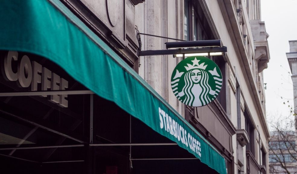
6 Essential Tips for Choosing the Perfect Business Sign
When you walk down a street and come across a business sign that immediately catches your eye, you can't help but feel drawn toward it. And before you know it, you're stepping into that store, curious to explore what they offer.
That is the power of a great sign.
Think of your business sign as your personal ambassador, tirelessly working to attract customers and make a lasting impression. It goes beyond mere decorative elements; it's a vital tool that showcases your brand, communicates your message, and sets your company apart with a professional touch.
However, we understand that finding the perfect sign for your business can get overwhelming for numerous reasons. But fear not! We're here to help with this guide to signage selection.
1. Budget
Commercial signage solutions from Image Technique can range from affordable to luxurious, depending on factors such as size and materials used. It's always wise to prepare a budget and be open to the possibility of going slightly over it.
Remember, your sign is an investment in your brand's first impression on potential customers. Consider it a worthwhile expense that pays off in the long run.
2. Purpose of the signage
What do you want your commercial signage to achieve – drive more sales, inform and educate, or advertise and promote your company?
Your sign's purpose must align with your marketing strategy and business goals. Different signs serve different purposes, whether increasing brand awareness or luring customers from far and wide.
3. Understanding your audience
Before you make a decision, you need to know who you're trying to reach.
The demographics of your target customers will play a significant role in determining the style and material of your sign. An elegant design is the key to making a lasting impression on passersby, whether on a busy street or at a complex intersection.
But what if your sign is placed inside a building?
In that case, you have more freedom to include additional information. Your customers will have more time to absorb the message. However, it's still important to consider your customer demographic.
A posh neighbourhood might prefer a more sophisticated and elegant sign, while a bustling area might respond better to vibrant colours and catchy graphics.
4. Creative and eye-catching
Your sign should visually represent your business, capturing its essence in a single glance.
Think big, bold, and beautiful!
A well-designed sign increases the chances of someone stopping in their tracks or remembering your brand long after passing by.
Don't be afraid to showcase your company's colours, but remember that different colours evoke different emotions, so choose wisely to make the desired impact.
5. Keep it simple
If your sign is overly complicated to decipher, it won't serve its purpose effectively.
Opt for a clean, easy-to-read design. Choose a font that is big and bold, ensuring quick readability for those driving or walking by. But also, don't overcrowd the sign with too much information; keep your message concise and impactful.
6. Maintenance
You might have the most stunning sign in town, but it can quickly become a headache if it requires constant cleaning or expensive repairs.
Take into account the weather conditions in your area. If scorching summers are the norm, avoid materials that might fade under the blazing sun. Likewise, if you're in for a frosty winter, choose signs that can withstand the elements without frequent replacements.
Wrapping up
The signage industry offers a vast array of options, from customizable exterior signs to eye-catching promotional flags and versatile vinyl banners. Remember to create signage reflecting your brand's essence and sending the perfect message to your target audience.


